Client
- Skechers
Date
- April - August 2017
Key Deliverables
- Competitive Strategy
- Logo & Style Elements
- Packaging Concept


THE MISSION
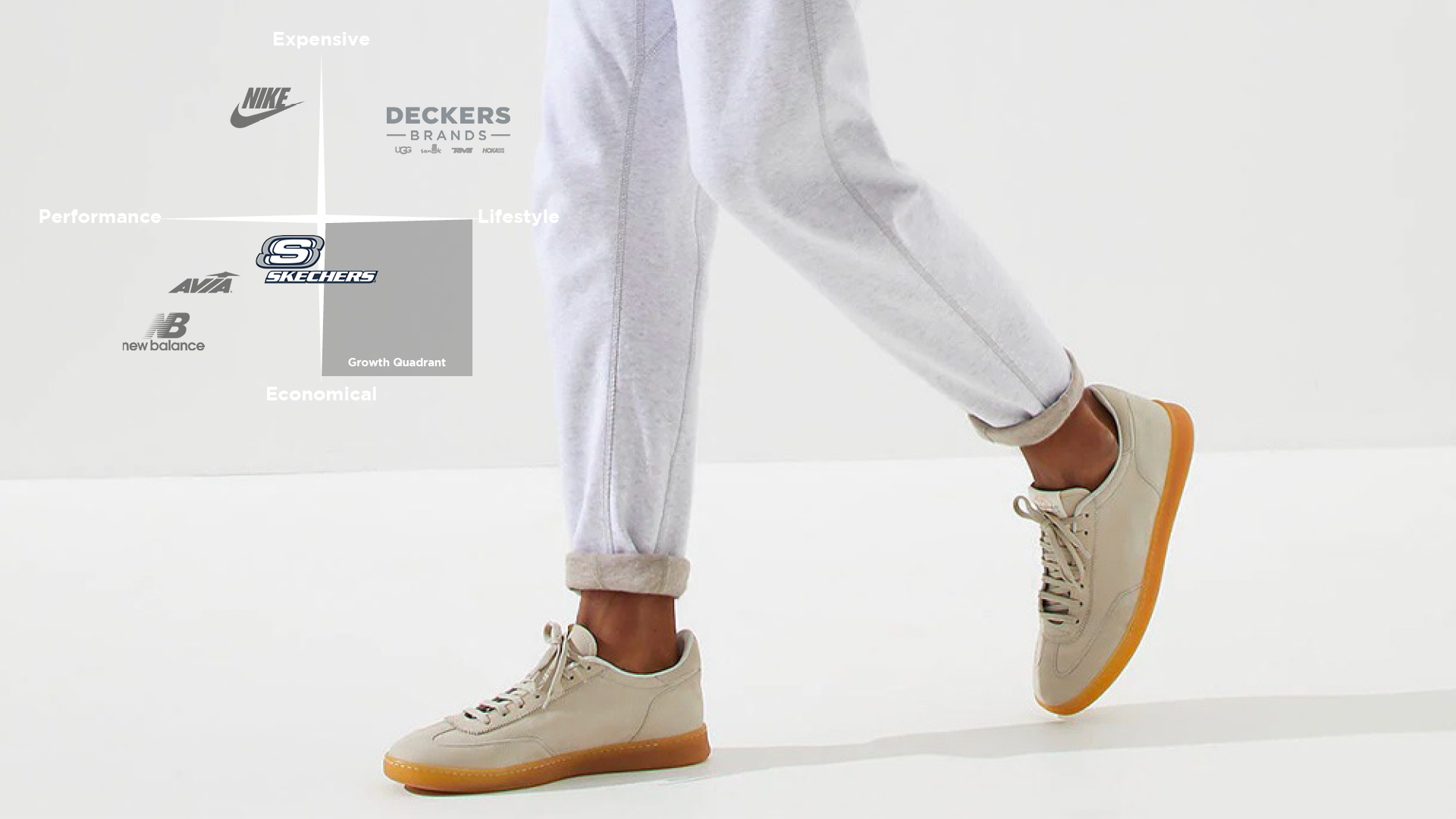
Skechers is a multinational American footwear brand founded in 1992 in Manhattan beach, CA. Skechers does $5.22 billion in revenue and operates 3,550 retail stores across 160 countries. In 2017, Skechers was the third largest shoe brand by market share in the US. Recent gains in market share were driven specifically by womens, boys and girls categories. These sales are believed to be caused by the emerging athleisure trend and international expansion. As a whole, Skechers is growing rapidly, although sales in the mens category and specifically the Relaxed Fit line are slowing.
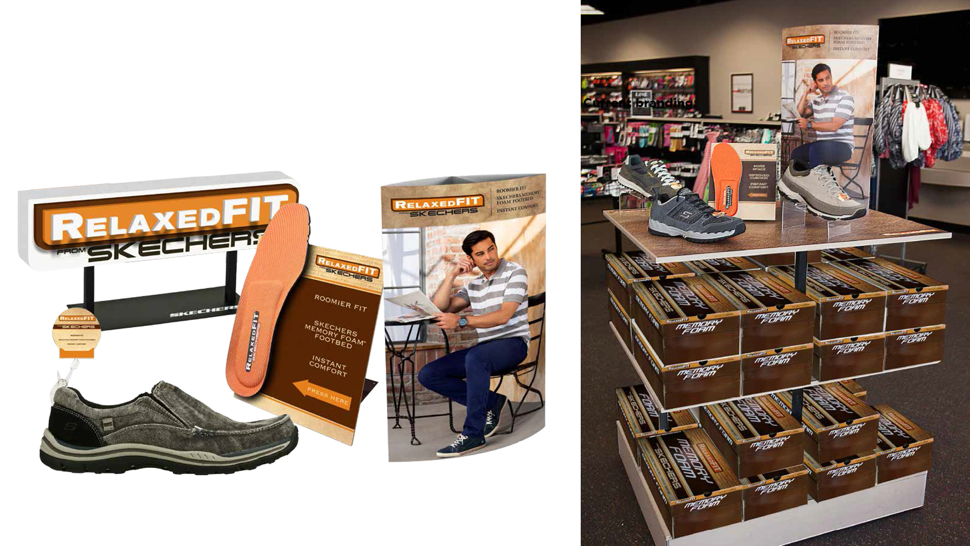
In an effort to explore potential re-branding strategies, the brand design team at Skechers approached me and my colleagues to form an educational partnership. We were each asked to envision and pitch a re-brand of the mens Relaxed Fit line of footwear that could help revitalize dwindling sales and interest.
"How can re-branding the mens Relaxed Fit line attract new customers?"

THE APPROACH

Designing the concept
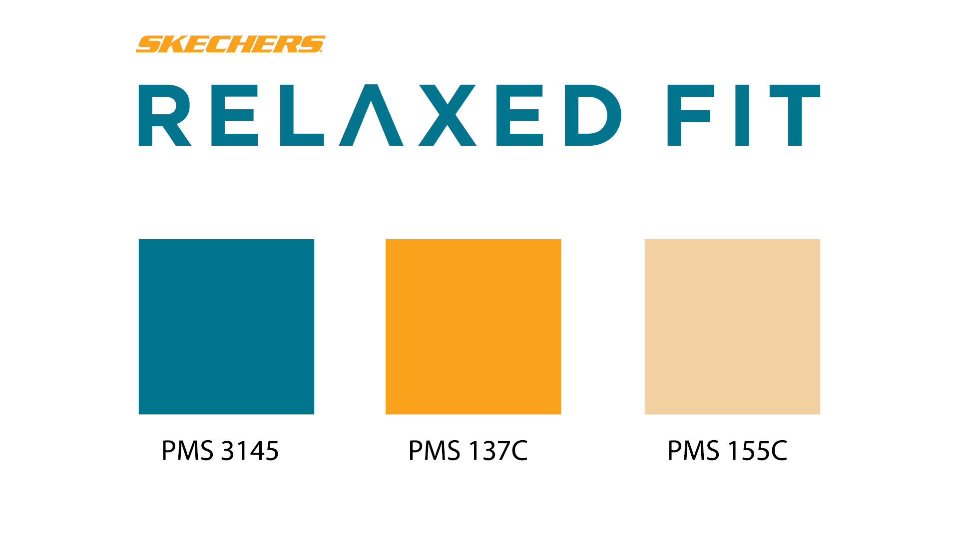
The key to an effective branding system is consistency of emotional cues across all of the applications. In the case of Relaxed Fit, the target response should elicit feelings of unpretentious comfort, distinguished boldness and honesty. Manifesting those feelings begins with the choice of typeface. A well-designed typeface frames written content with character and personality. For Relaxed Fit, my exploration of various font families led to modern, bold, sans serif fonts; Ultimately, arriving at Gotham Bold.
Although typefaces already have character and personality, specific qualities can be emphasized through logo treatments. Widening the kerning and modifying the letter ‘a’ in ‘Relaxed’ produced a logotype that is comfortable and bold at the same time.
The logotype is a central component of the brand system, but it is useful to have more versatile elements for less conventional applications as well. For example, an effective logomark can be used individually as a subtle callout to the brand or as a pattern to add visual texture and interest. Symbols can have an informational advantage over words by creating quick brand associations.
To compound the visual effects of branded elements, color has a strong influence on brand perception. As such, my color exploration resulted in a noble teal as the primary hue, paired with a golden orange and cream off-white accents.
THE RESULTS
Font / Typography

Logo / Color Palette